Color Psychology in Web Design
Color Psychology in Web Design is nothing but choosing the right color in your design which is meaningful and conveys the ideas or message of your brand. In other word Color psychology in web design refers to the study of how colors impact human emotions, behavior, and perceptions. Designers use this understanding to strategically choose and apply colors in the creation of websites to evoke specific responses from visitors. Different colors can elicit various emotions and convey distinct messages, making color a powerful tool in web design.
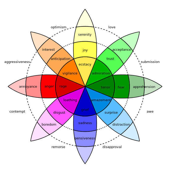
Color psychology in web design is so powerful that not only influences how people feel but what they do. The psychology of color helps strengthen your brand, encourage sales, and even guide visitors towards specific pages on actions on your website. There are psychological meanings in each color and it is believed that people get influenced because of color as well. Which is why it is important to choose hues to influence consumer behavior since every color is associated with different emotions. The use of color in design can affect the emotion and moods of people viewing those color palette. Using colors wisely can improve user experience and increase desired behaviors (including conversion rates) in significant ways.
Color psychology of each color
- Red:
- Associations: Passion, energy, excitement, urgency.
- Use: Often used for calls to action, buttons, and elements that require attention.
- Blue:
- Associations: Trust, calmness, professionalism, reliability.
- Use: Commonly used in corporate websites, social media platforms, and brands aiming to convey trustworthiness.
- Green:
- Associations: Nature, growth, health, tranquility.
- Use: Suitable for eco-friendly and health-related websites, as well as brands promoting sustainability.
- Yellow:
- Associations: Happiness, optimism, warmth, attention-grabbing.
- Use: Often used to draw attention, highlight elements, and create a sense of positivity.
- Orange:
- Associations: Creativity, energy, enthusiasm, warmth.
- Use: Appeals to a youthful audience, often used in entertainment and food industries.
- Purple:
- Associations: Royalty, luxury, sophistication, mystery.
- Use: Commonly used in high-end brands and products, as well as creative and artistic websites.
- Pink:
- Associations: Femininity, romance, sweetness, playfulness.
- Use: Often used in websites targeting a female audience or conveying a sense of romance and charm.
- Black:
- Associations: Elegance, sophistication, power, mystery.
- Use: Commonly used in luxury brands, fashion, and technology to convey a sleek and modern look.
- White:
- Associations: Purity, simplicity, cleanliness, openness.
- Use: Frequently used as a background color, especially in minimalist and clean designs.
- Brown:
- Associations: Earthiness, reliability, warmth, simplicity.
- Use: Suitable for outdoor and nature-related brands, as well as those aiming for a vintage or rustic look.
Color psychology use in different fields
It’s important to note that cultural and individual differences can influence the interpretation of colors, so Color Psychology in Web Design need to consider the target audience and context when choosing colors for a website. Additionally, using a harmonious color scheme that complements the brand identity and message contributes to a visually appealing and effective design.
- Red:
- Marketing/Advertising: Often used to grab attention and create a sense of urgency.
- Food Industry: Used to stimulate appetite and convey a sense of energy.
- Blue:
- Corporate Branding: Conveys professionalism and trust.
- Technology: Used to create a sense of reliability and innovation.
- Green:
- Health and Wellness: Conveys a sense of health and well-being.
- Environmental and Sustainable Brands: Represents eco-friendliness.
- Yellow:
- Retail: Attracts attention and is often associated with sales and discounts.
- Creative Industries: Adds a playful and energetic touch.
- Orange:
- Entertainment: Adds a lively and fun element.
- Food Industry: Stimulates appetite and creates a warm ambiance.
- Purple:
- Luxury Brands: Conveys elegance and exclusivity.
- Creative and Artistic Fields: Adds a touch of creativity and mystery.
- Pink:
- Fashion and Beauty: Appeals to a female audience.
- Children’s Products: Conveys a sense of playfulness.
- Black:
- Fashion: Often used to create a sleek and modern look.
- Luxury Products: Adds a sense of exclusivity.
- White:
- Minimalist Designs: Emphasizes simplicity and clarity.
- Health and Wellness: Conveys cleanliness and sterility.
- Brown:
- Outdoor and Nature Brands: Represents a connection to the earth.
- Food Industry: Creates a warm and comforting feel
Color psychology in Web Design
Understanding the psychology of colors can help designers make informed choices that align with the desired emotions and messages in various industries and contexts. Color psychology in Web Design must be according to your content.
- Consider the Brand Identity:
- Why: Colors should align with the brand’s personality, values, and message. Consistency in color choices helps reinforce brand recognition.
- Example: A tech brand aiming for trustworthiness might choose blues, while a vibrant and energetic brand might opt for bold reds or oranges.
- Understand the Target Audience:
- Why: Different demographics and cultures may have varied responses to colors. Consider the preferences and cultural associations of your target audience.
- Example: If your audience is in the health and wellness industry, calming greens and whites might be appropriate.
- Create a Cohesive Color Scheme:
- Why: A harmonious color palette enhances visual appeal and user experience. Use color combinations that complement each other.
- Example: Analogous color schemes, where colors are next to each other on the color wheel, often create a pleasing and cohesive look.
- Focus on Readability:
- Why: Ensure that text is easily readable against the background. High contrast between text and background colors improves readability.
- Example: Black text on a white background or vice versa is a classic and effective choice for readability.
Color Psychology for web design
- Use Accent Colors Strategically:
- Why: Highlight important elements or calls to action with accent colors. This draws attention to specific areas of the page.
- Example: Using a vibrant color for buttons or links can guide users to take desired actions.
- Emphasize Brand Personality:
- Why: Colors can convey specific emotions and characteristics. Choose colors that reflect the brand’s personality and resonate with the target audience.
- Example: A fun and youthful brand might use bright and playful colors, while a more serious and professional brand may opt for muted tones.
- Stay on Trend (If Appropriate):
- Why: Depending on the brand and industry, staying current with design trends can convey a sense of modernity and relevance.
- Example: Flat design and muted color palettes were popular trends in web design for a period.
- Test and Iterate:
- Why: User feedback and data can provide insights into the effectiveness of your color choices. A/B testing can help identify which color schemes resonate best with your audience.
- Example: Testing different button colors to see which yields a higher conversion rate can inform future design decisions.